Undertaking a website project of any kind is often a challenge, a journey, and importantly a gauntlet of validation for brand values and lofty philosophical concepts. It’s a complex puzzle that requires a significant amount of thought, iteration, and management—of opinions, feedback, and the ever-present strategy pivot consideration. Often, it unfolds into a web (very bad pun, apologies) of even more questions.
So, you may ask, why take on this project for ourselves? There was no getting around it: It was time.
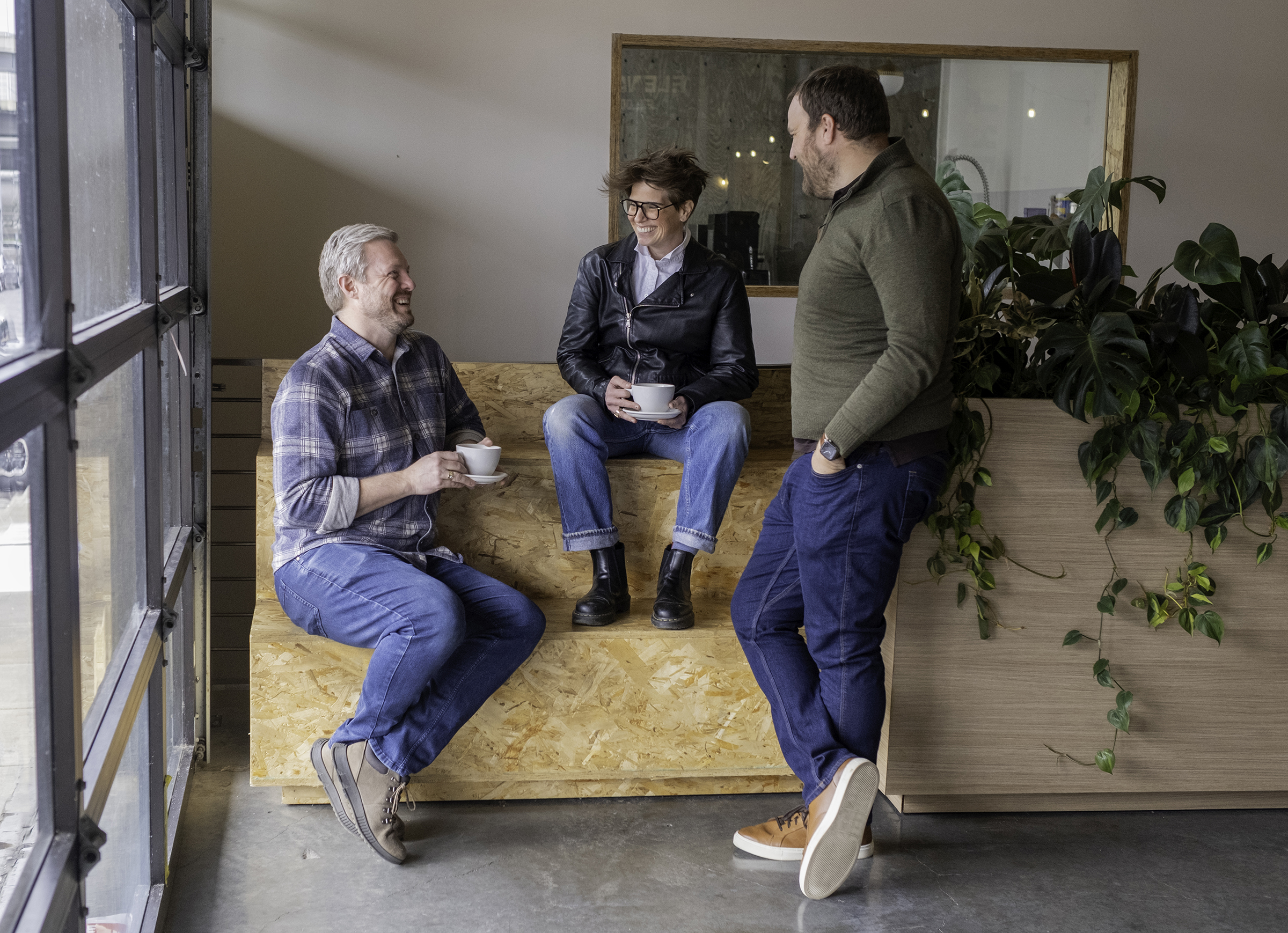
Our Creative Services department identified some needs in conjunction with the rest of our G&G crew, and some casual conversations were had over time. Understanding that while our previous site was functional, it fell short of showcasing our full talents and abilities. Eventually those conversations snowballed into a concrete starting line, and the team got excited to run the race with a G&G pinnie on our backs.
We initiated the project by outlining goals, pulling in key internal stakeholders to align on a focused set of things we wanted to accomplish. Those were:
Feeling good about this, we moved into a few brand exercises as an entire company to pin down some choices about brand voice and to narrow the mood of our website. This largely came in a series of polls—”Good & Gold is informed and accessible and is not pretentious or complicated”—that we then distilled to some throughlines. For some additional conceptual thought (and maybe a little fun), we also asked everyone to choose a building that represented the brand.
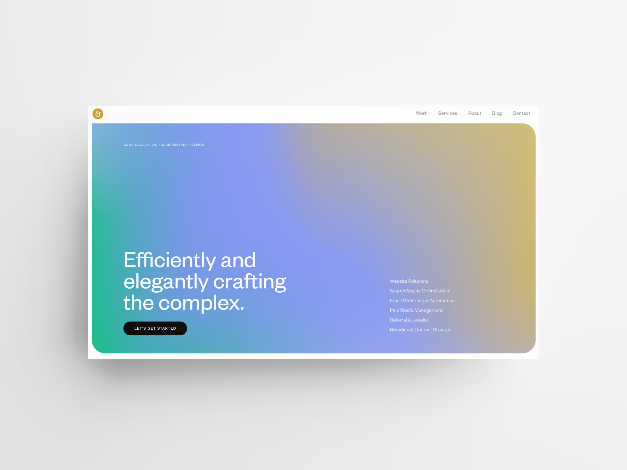
All of these exercises helped us confidently approach a consensus tonally, and we next needed to extend that feeling visually.
Pulling all of the information on emotional cues and strategic planning we had on hand, our next move was to begin our standard process for website projects, beginning with moodboards. Here, our research yielded a lot of observations about where we wanted to take things: minimal with an infusion of color, current via typeface and size choices, no flagrantly loud illustrations but definitely some excitement through scale relationships.

Moodboarding is a highly valued part of our process. It allows us to minimize dissonance and creates the beginnings of a clear roadmap. We’re able to make some firm decisions up front that saves us time later.
Naturally, the step after is to begin wireframing to further lock in specifics. “How will this content be delineated across this flow?” “Where are we focusing a user’s attention?” and “What does this look like scaled to different screens?” are all questions we ask during this period. It’s incredibly important to us to land with a layout framework that’s well-defined so we can move into development with clear specifications.
After iterating through several wireframe versions, and with more granular details like element states and interaction notes documented, we tackled the build.
Our team makes a serious point to keep an eye on emerging platforms and new tools to help improve efficiency and our ability to generate MVPs quickly (we just switched everyone to Figma, for instance). What unveiled itself during our discovery phase was the desire to rapidly iterate in something closer to a live environment, with the added need of control over technical bells and whistles for animations and layouts. Serendipitously, Webflow reminded us of its existence at the perfect time and, having toyed with the idea previously, we knew it was ideal for taking our site to launch.
Webflow allowed us to implement the different responsive variations needed for our design without needing to extend ourselves into by-hand development. As a lean team and organization, the ability to leverage a no-code platform greatly sped up the pen-to-paper parts of the build and we could validate sections on the fly. Personally, the previously mentioned control proved to be incredibly empowering.
On the management side, it has a fantastic CMS that let us model and reference different datasets, all of which can be edited by other team members in an easy-to-use editor interface, meaning we can truly work in a distributed way.
With all stakeholders on board, all team members providing their final feedback, and having finally stepped away from our own design microscopes, we’ve officially shipped the very website you’re reading this on. We had a profoundly productive time working on this new website and are incredibly proud of the work. We hope you enjoy it!
Note: This overall experience has pushed Webflow to the near top of our recommended platforms (Shopify still holds the e-commerce crown…for now), and since we’ve run the gauntlet ourselves, we’d love to take you on that journey as well.