
When Hiwire approached us, they were ready for a brand identity that matched the ambition of their work. Their studio bridges aerospace-grade engineering with contemporary art, taking projects from a napkin sketch to a towering monument. With tools that range from large-format 3D printing to traditional casting, their process is as malleable as it is precise. What they needed was a brand that could carry that duality: artful and technical, premium but approachable.
Hiwire works with two distinct audiences. On one side: artists, curators, and public art coordinators looking for bold, experimental fabrication. On the other: brands and agencies like Nike who need fast-turn, reliable environmental design builds. The identity had to resonate with both worlds, conveying design intelligence without positioning Hiwire as a competing agency. It had to inspire trust from engineers and spark imagination in artists.
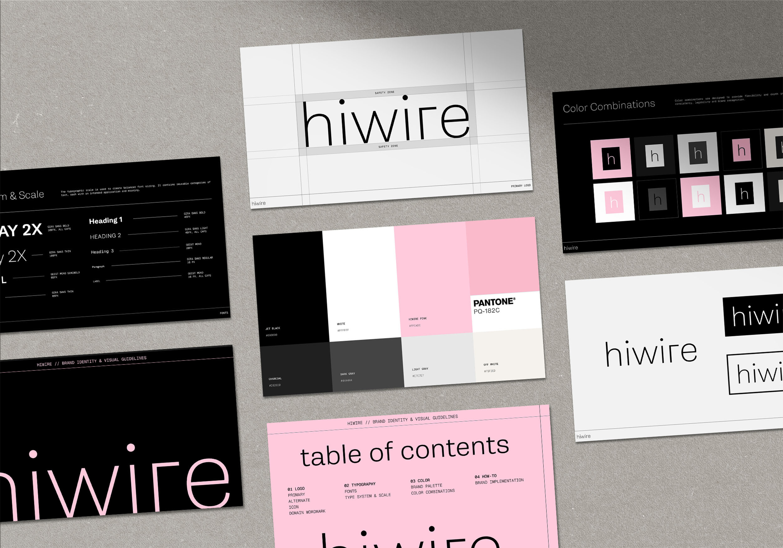
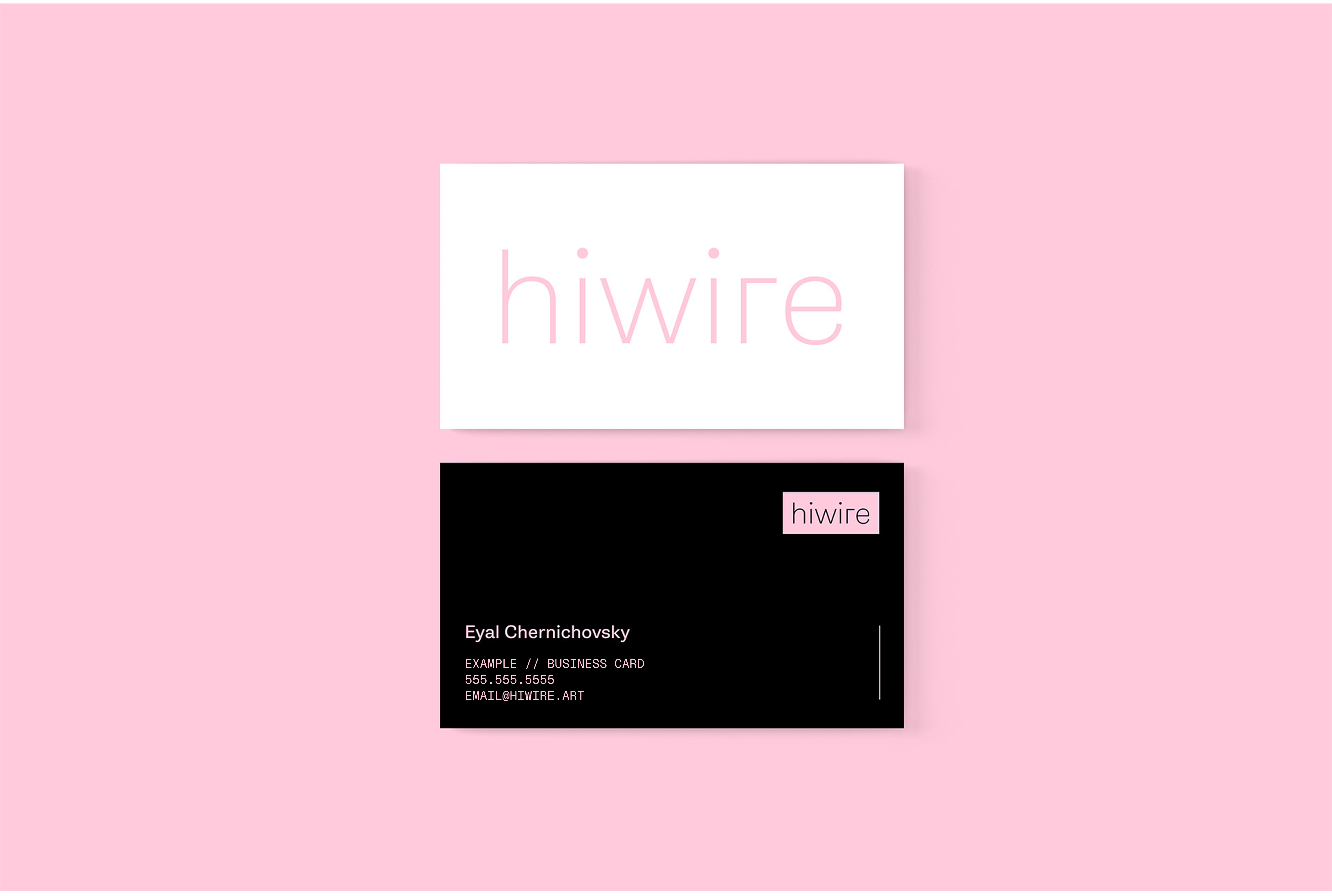
We began by exploring logo directions and icon concepts, testing how far we could push the balance between precision and play. That exploration led to a lowercase, thin-stroke wordmark, supported by a condensed secondary logo and an icon built for instant recognition at small scale—whether etched into metal or as a social avatar.
Then came the fun part.
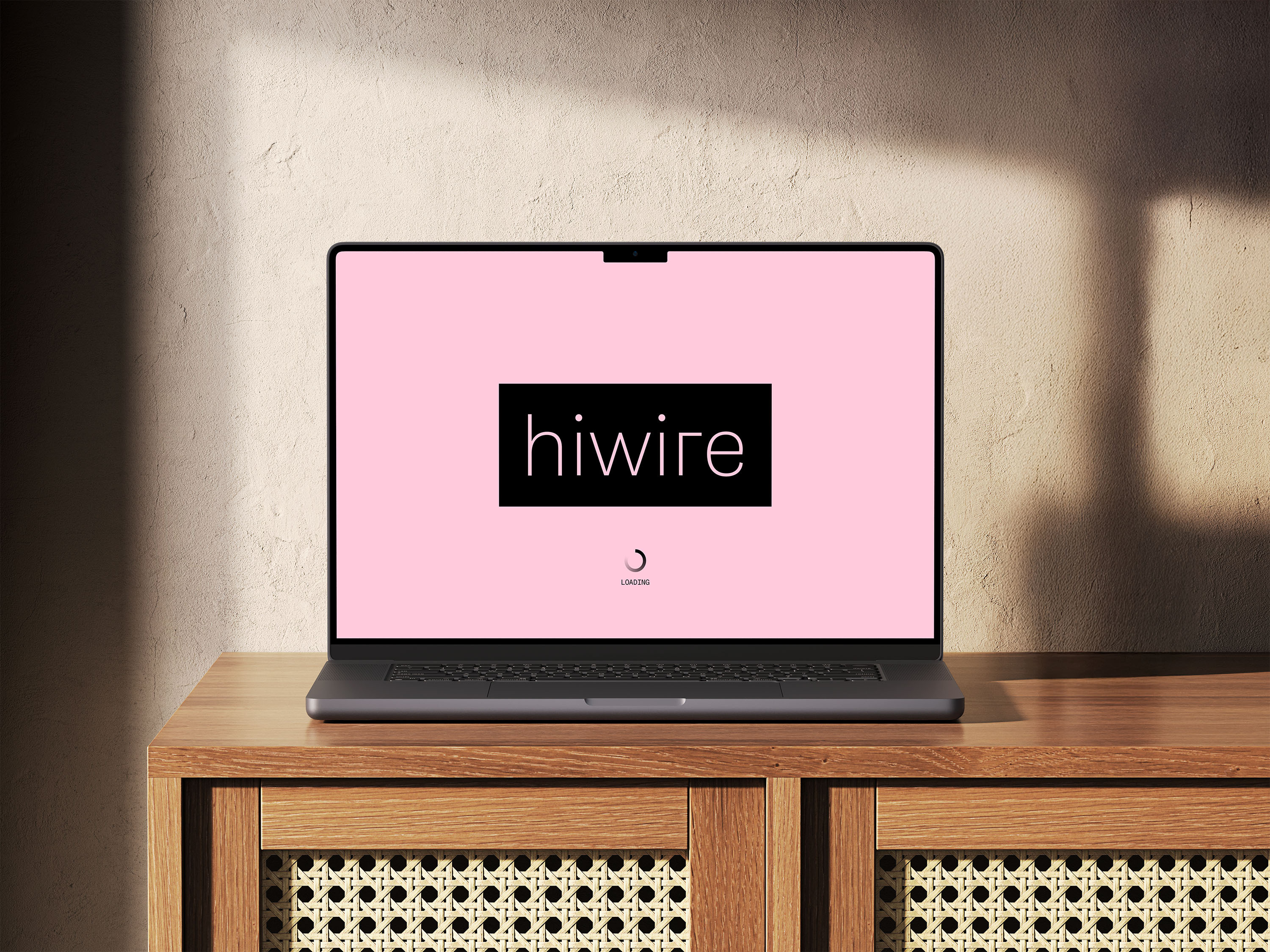
Hiwire’s palette puts a bold, unexpected hero pink at the center—a deliberate break from the muted, cool, or earthy tones common in the category. Paired with grounding black and layered neutrals, the color brings an edge that’s striking and unmistakable, while still flexing easily between artistic expression and technical clarity. That same balance extends into a type system that fuses modern warmth with engineered precision, mirroring Hiwire’s dual identity.
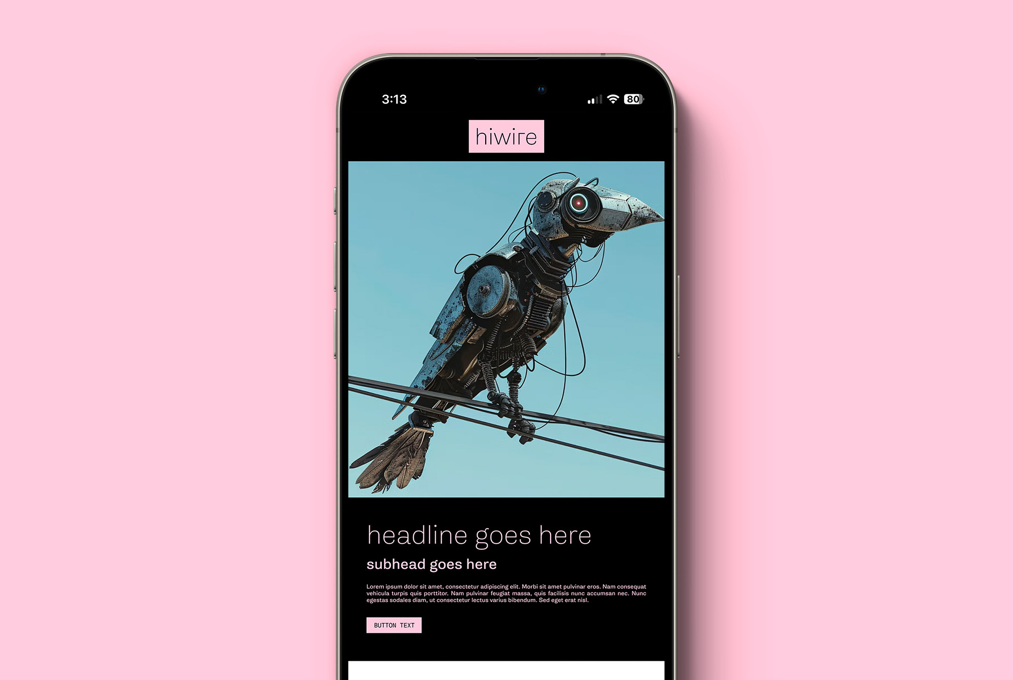
A visual storytelling system emerged in wire-like strokes, layered textures, fabrication-inspired details, and dissonant shades.
The new Hiwire identity is modern, flexible, and instantly recognizable, with a visual language that is both reflects and labels hiwire. When artists, engineers, or agencies encounter the brand, they see bold imagination, rigorous execution, and the belief that anything is possible when art and engineering meet.
What began as an exploration of logos became a complete toolkit:
- Logo system (logo, wordmark, icon)
- Typography guidelines
- Color palette
- Visual language


